How Data Storytelling Can Drive Meaningful Change
Data storytelling is a powerful approach that goes beyond merely presenting numbers and statistics. It combines data analysis with narrative techniques to create compelling stories that resonate with audiences. By weaving together data visualizations and contextual insights, organizations can illustrate complex issues in a way that is both understandable and engaging. For instance, a nonprofit advocating for climate change action might use data storytelling to showcase how rising temperatures affect local wildlife, effectively driving home the urgent need for policy change.
Furthermore, effectively told data stories can inspire action and drive meaningful change by connecting with audiences on an emotional level. When people understand the implications of data through real-life examples and relatable narratives, they are more likely to take action. Organizations leveraging data storytelling can encourage stakeholders, whether they be employees, customers, or policymakers, to engage with the issues at hand. This emotional connection can transform data from just numbers into a call to action, making it an invaluable tool for advocacy and transformation.
Turning Raw Data into Compelling Narratives: A Step-by-Step Guide
Turning raw data into compelling narratives requires a systematic approach that transforms figures into stories people can relate to. Start by identifying your target audience; understanding their needs and preferences will guide your narrative style. Next, organize your data, using tools like spreadsheets or databases to sort and filter significant trends. Once your data is organized, choose the key insights that resonate most with your audience, as these will form the backbone of your story.
After selecting your insights, it's essential to craft a compelling narrative. Begin with a captivating introduction that sets the stage for your story, followed by the main body where you present your data in a digestible manner. Use visual aids like charts or graphs to supplement your narrative and maintain the audience's interest. Lastly, conclude with a strong ending that summarizes your findings and suggests implications or actions to be taken. Remember, the goal is to connect with your audience on an emotional level while providing them with invaluable insights from the data.
The Impact of Visuals: How Design Enhances Data Communication
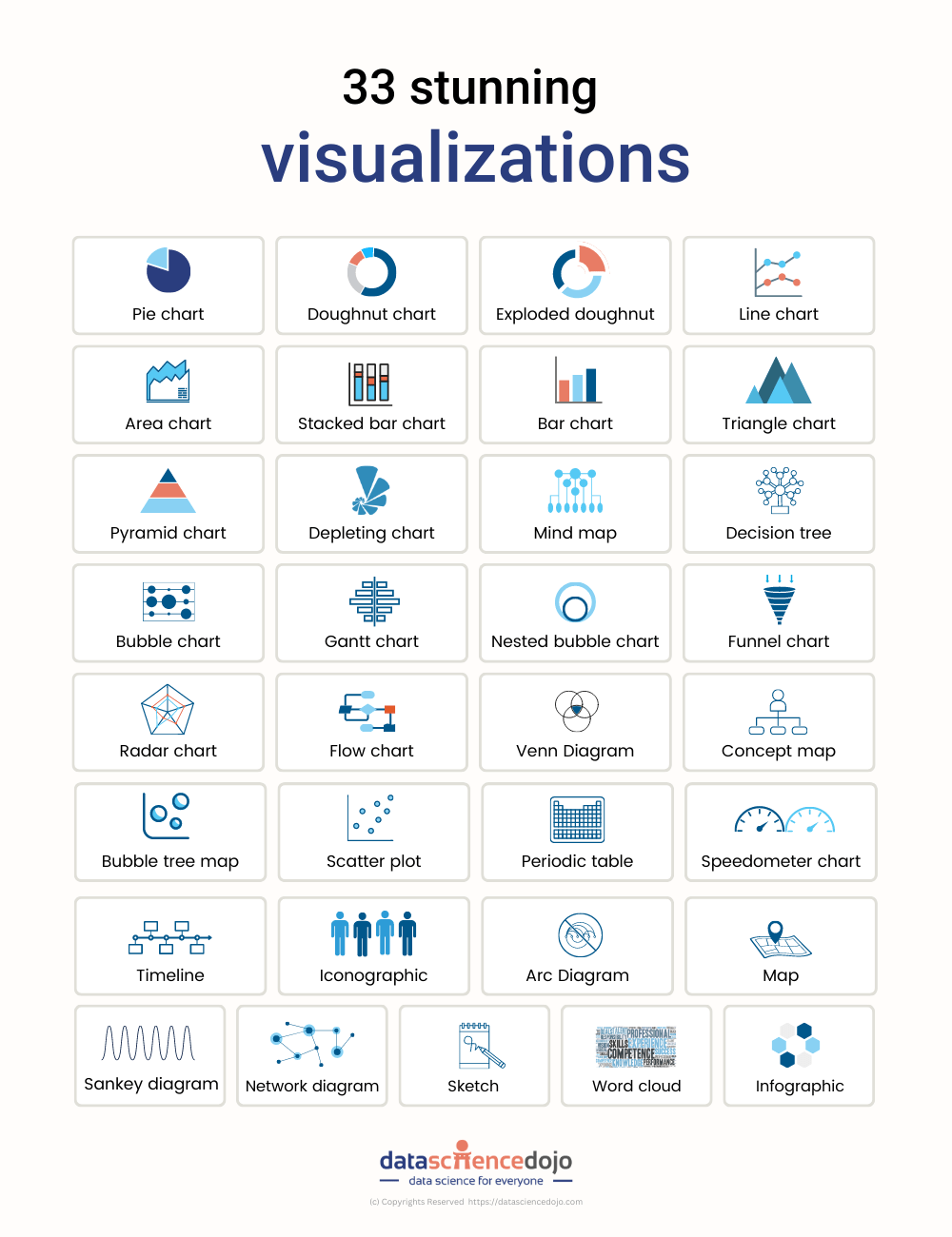
In today's fast-paced digital world, effective communication of data is more critical than ever. The use of visuals plays a pivotal role in enhancing our understanding of complex information. Data presented through infographics, charts, and graphs can simplify intricate details, making them more accessible and engaging for the audience. Research shows that people process visuals 60,000 times faster than text, underscoring the importance of integrating design elements into data communication strategies.
Moreover, the strategic use of color and layout can evoke emotions and influence decision-making. For instance, a well-designed pie chart can instantly convey proportions and comparisons, while a striking infographic can tell a compelling story that resonates with viewers. By harnessing the power of design, businesses and educators alike can transform mundane data into impactful narratives that not only inform but also inspire action. Therefore, investing in high-quality visuals is essential for anyone looking to enhance their data communication efforts.